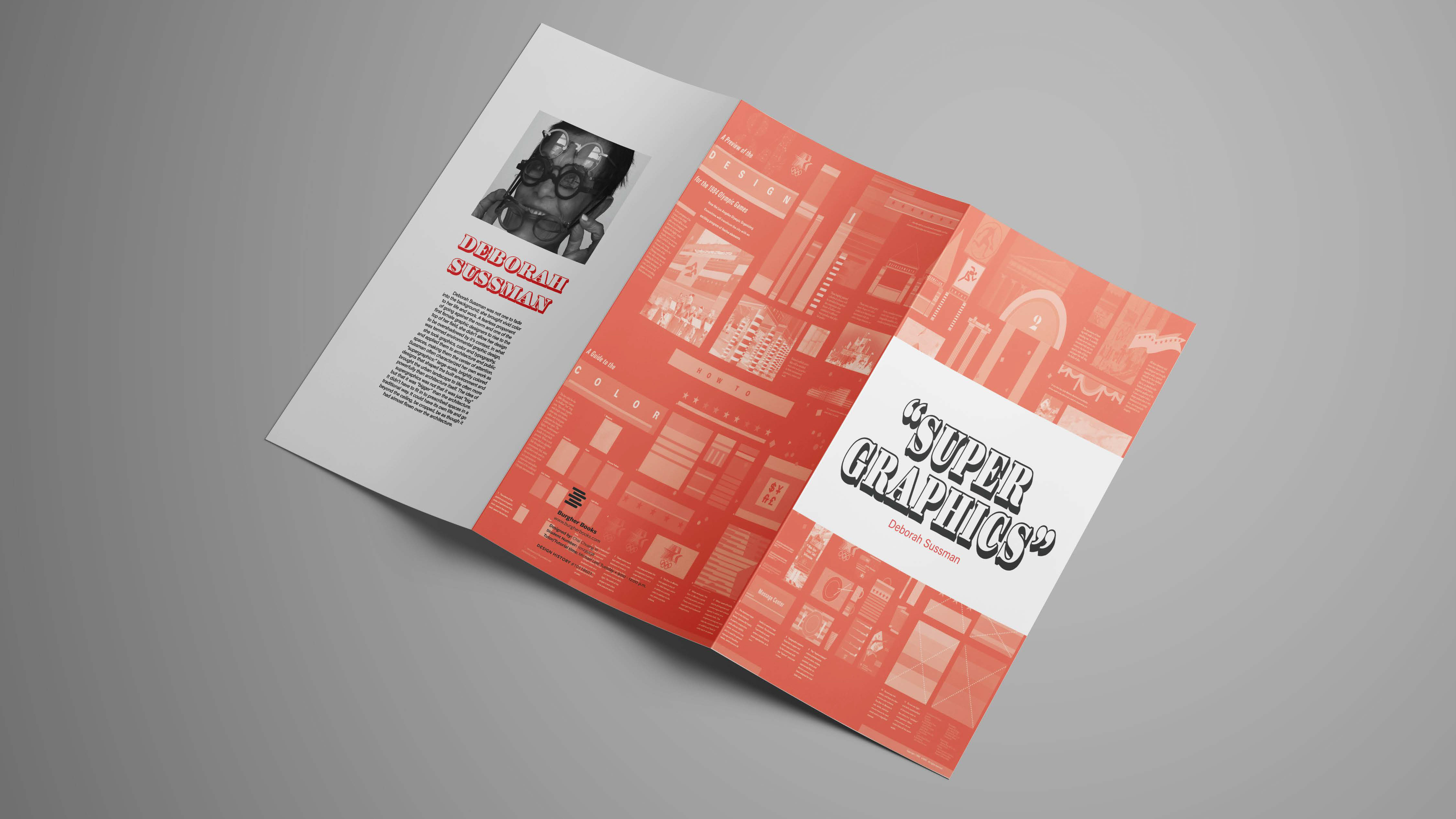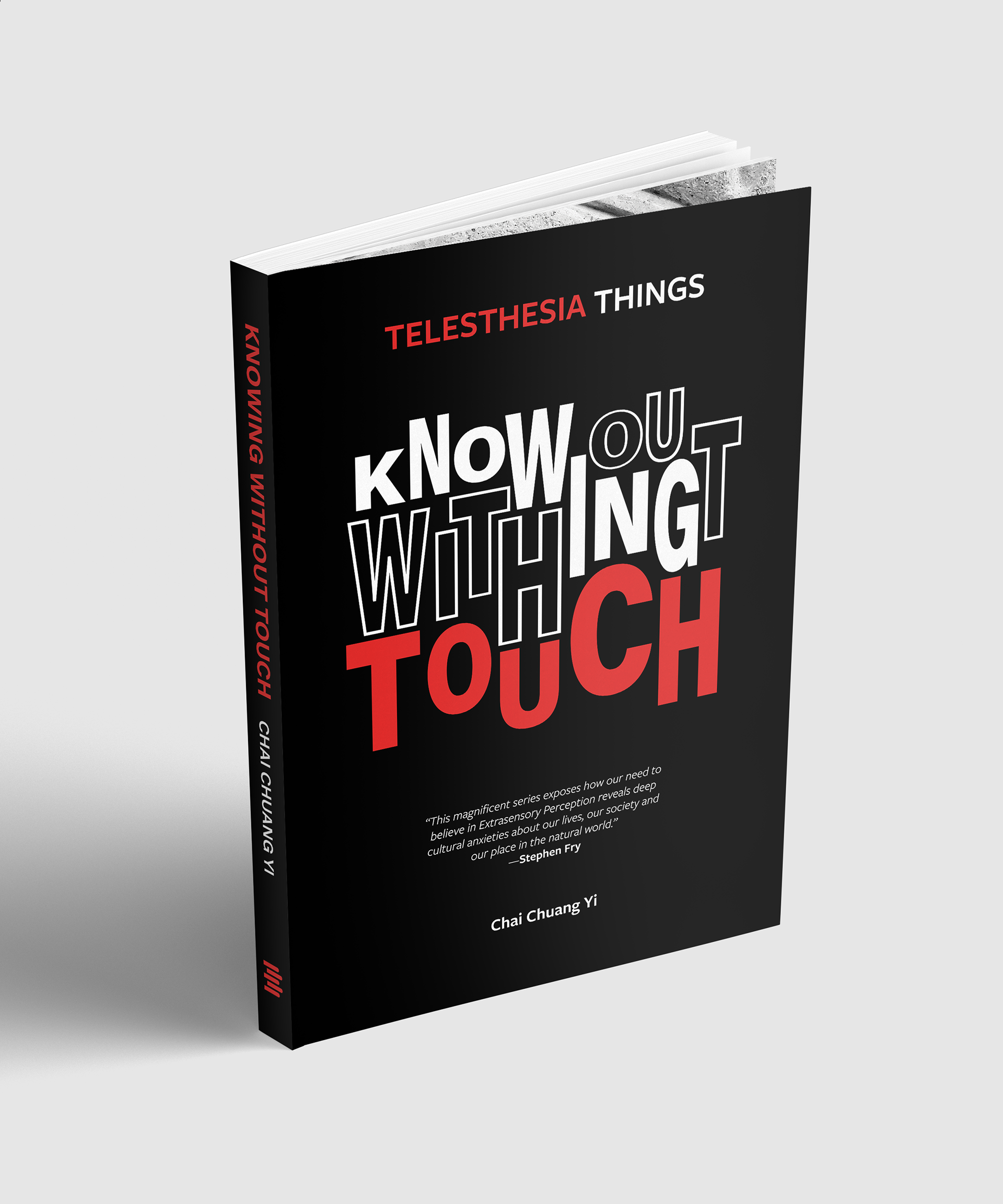
My chosen ESP was Telesthesia, which is the ability to know occurrences without using your known senses (hearing, seeing, touch, taste, or smell). My research and exploration led me to my chosen title, “Knowing Without Touch”, where I began focusing my attention on the visual potential of this title.
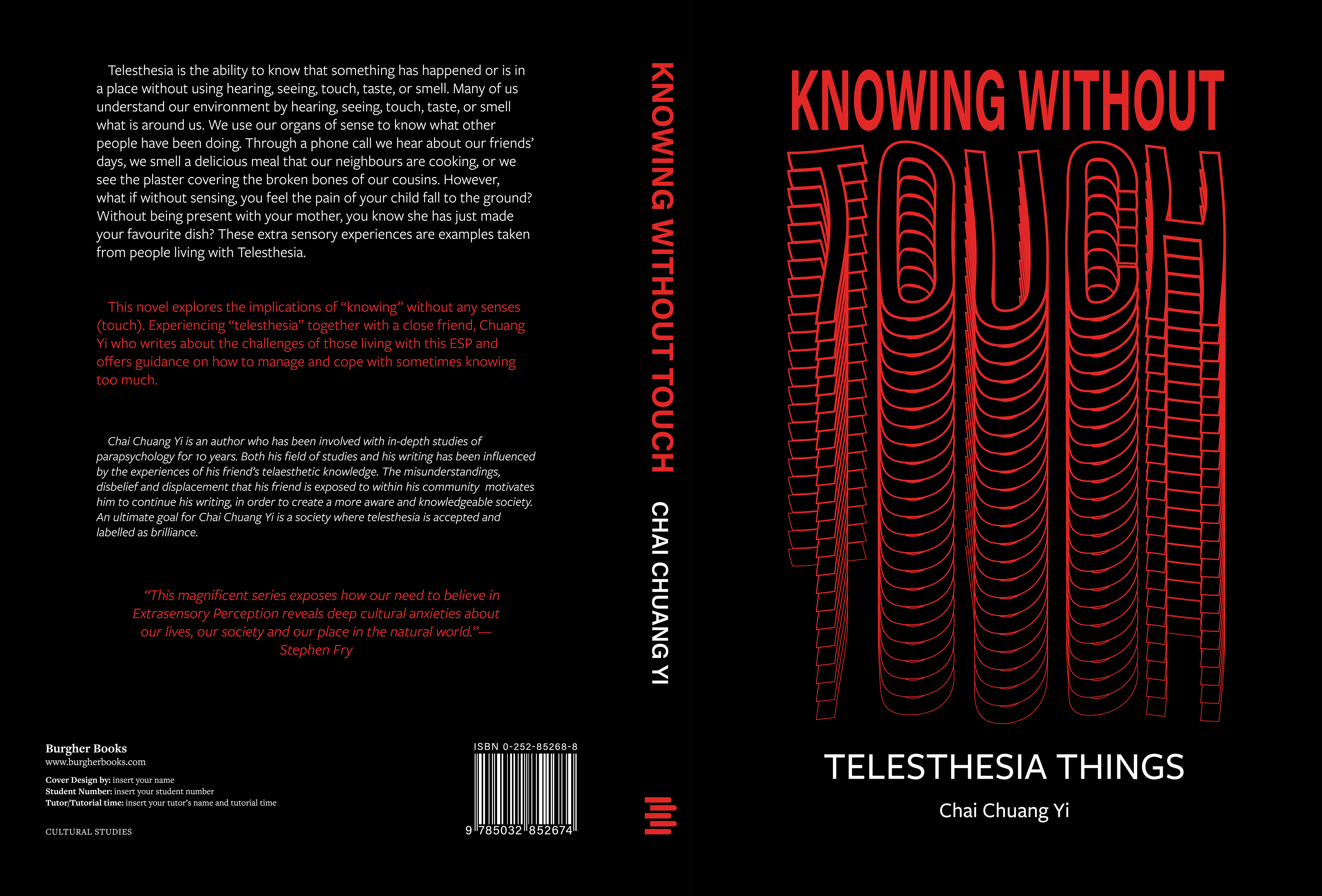
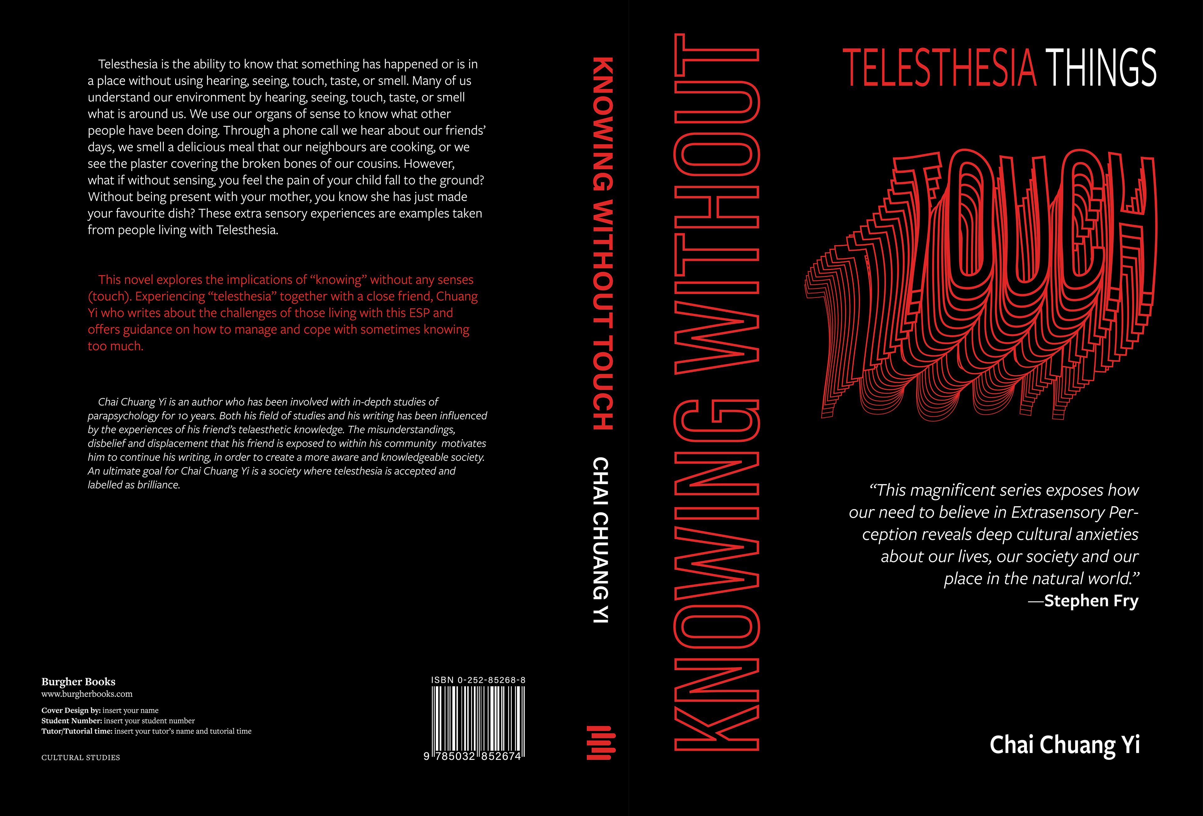
My visual strategy towards this brief was to explore the contradictory concept of “Knowing Without Sense”. The use of scale, proportion, and colour resonated well with this concept and were recurring visual techniques for my designs. Creating a focal point to represent the contrasting ideas within the book title was important. Focusing on “Touch” in particular, using the colour red allowed me to express the word more vibrantly and noticeably. Enhancing its scale created an interesting contrast between the word “Knowing Without” and further enhanced its typographical impact and relevance to my ESP. Playing the scale created an interesting composition placement and rhythm to express the waves of motor neurons, allowing telesthetic minds to feel what they are sensing physically. By using some graphic techniques, including feathering and editing the shape of the letterforms, I could give dimension to the word.
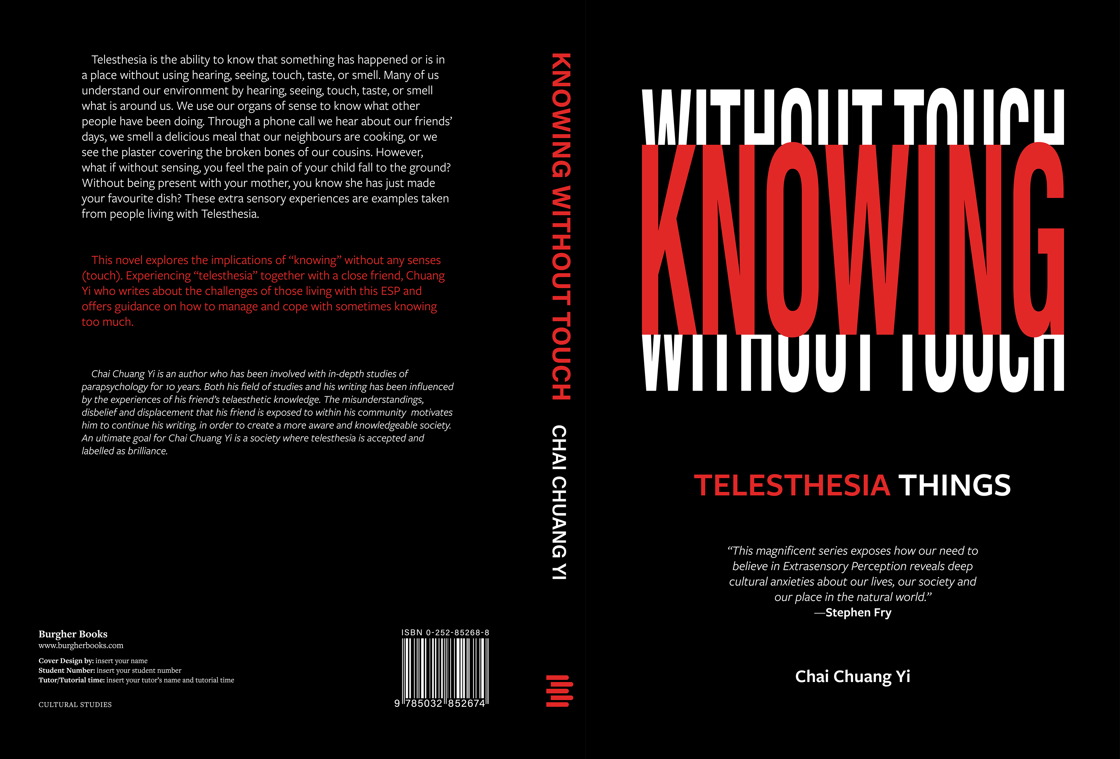
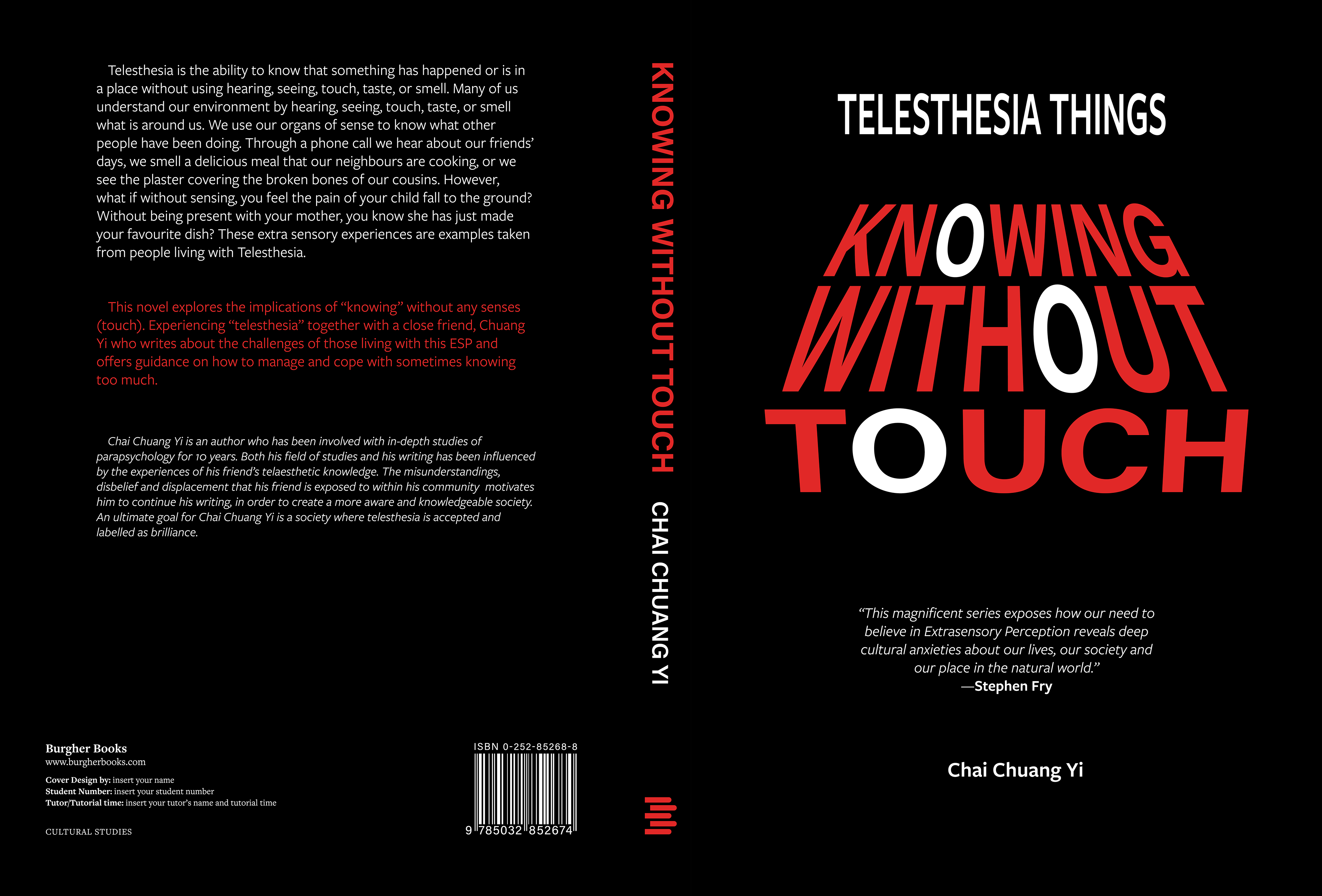
Using compositional space, I achieved balance and unity throughout my designs. Incorporating left justification and symmetry to the informational text on the back cover provided a basis for creating a legible and balanced composition. Using colour, scale and proportion, I created a typographic hierarchy and focused on each information element.
Throughout this brief, I explored ways to challenge the norms of conventional typesetting. My first final design is a successful example of this: I created an understated title through placement and rhythm rather than portraying the title as a main visual element. I focused on taking my designs past the boundaries of typography to convey my ESP in an emotional and expressive format.